Scano: Designing India's First Smile-Scanning Brand
A complete brand and product design system for ScanO — the AI-powered dental screening platform that makes preventive oral care accessible, modern, and approachable.
The Challenge
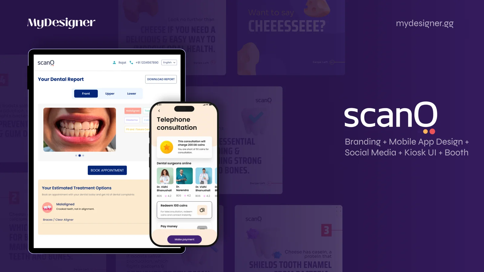
ScanO is an AI-powered dental screening platform that enables users to scan their smiles and receive instant oral health reports — a genuinely novel product category in India. The team had been operating under the DentalDost brand, but as ScanO evolved into a distinct consumer-facing product, it needed its own identity: one that could hold clinical credibility and consumer warmth in the same breath.
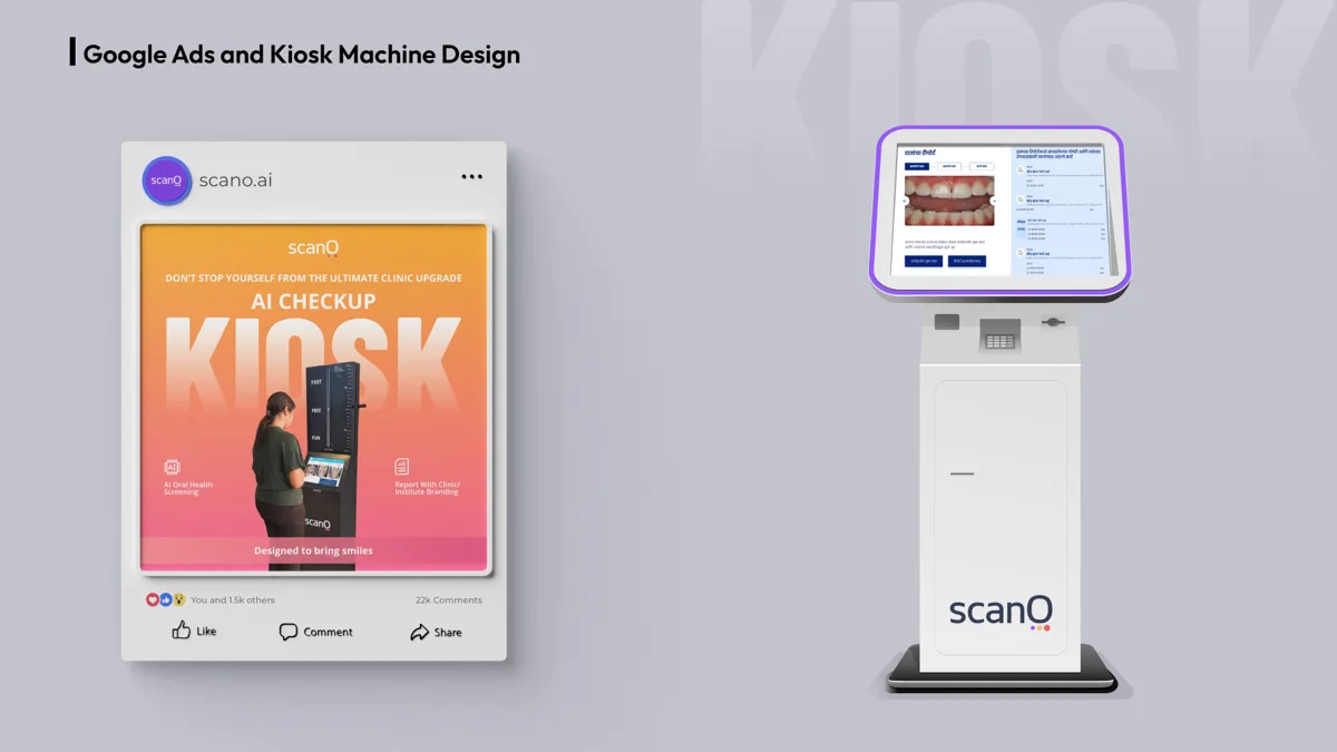
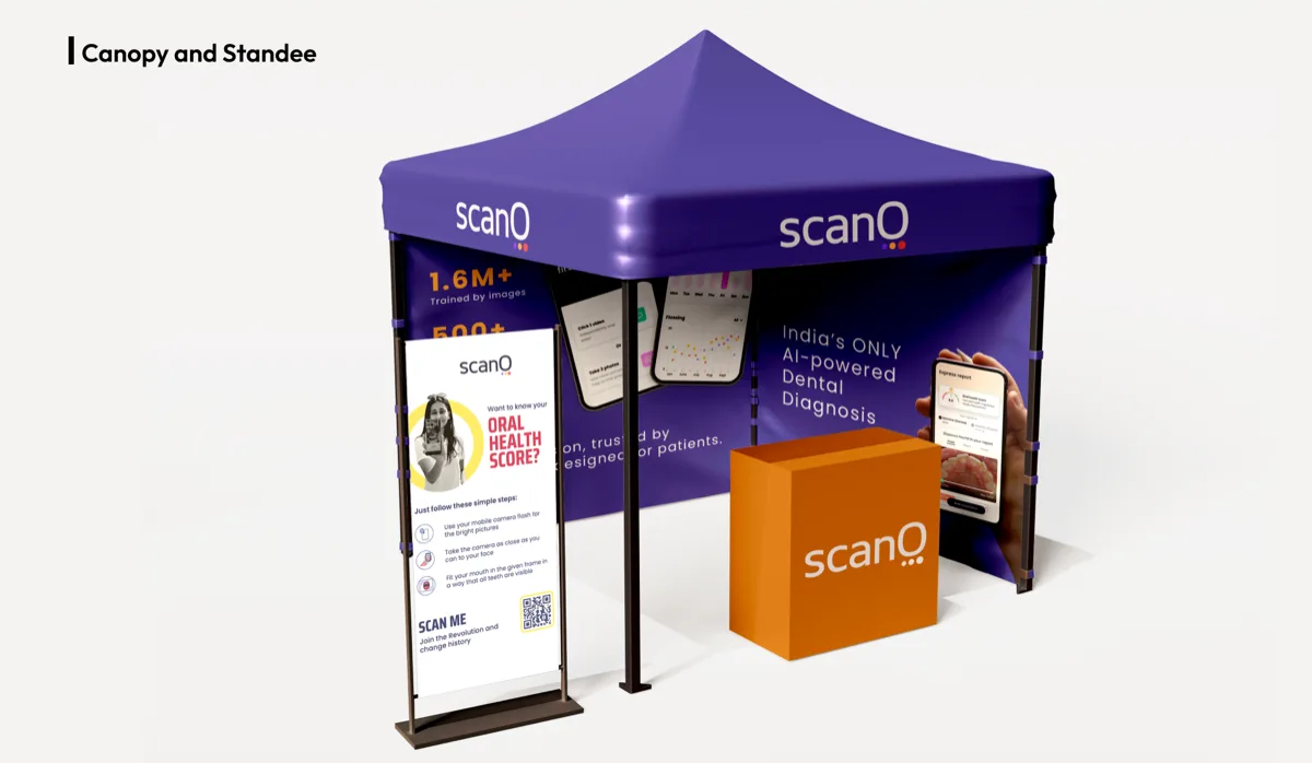
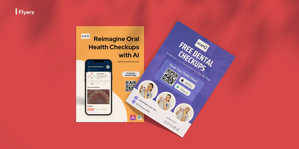
The design challenge extended far beyond a logo refresh. ScanO exists across a complex set of touchpoints — a mobile app that must feel intuitive and reassuring in the moment of scan, kiosk interfaces deployed at dental camps where users interact without instruction, and physical collateral like canopies, standees, and merchandise that project the brand in the real world. Each surface had its own constraints; all of them needed to feel unmistakably ScanO.
Our Approach
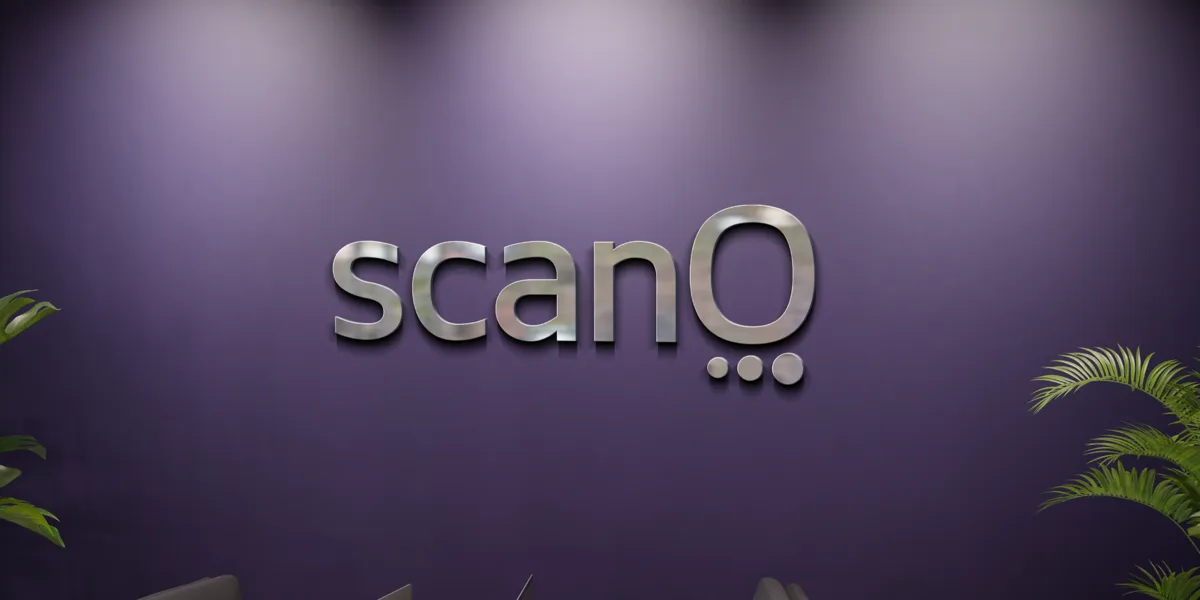
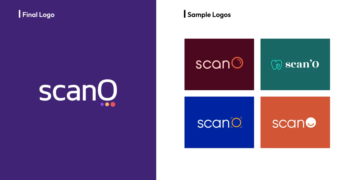
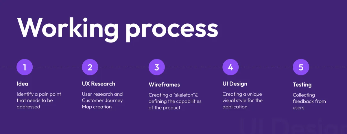
We began with identity — developing a visual language that positioned ScanO at the intersection of medical technology and consumer accessibility. The brand needed to signal precision and trust without the sterile detachment of traditional clinical design. We worked through logo concept, color, and typography choices that could flex from a phone screen to a 10-foot canopy while maintaining visual clarity and emotional warmth.
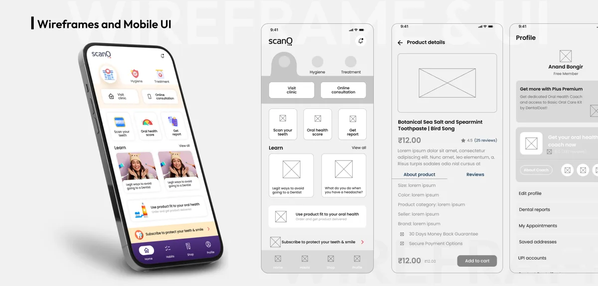
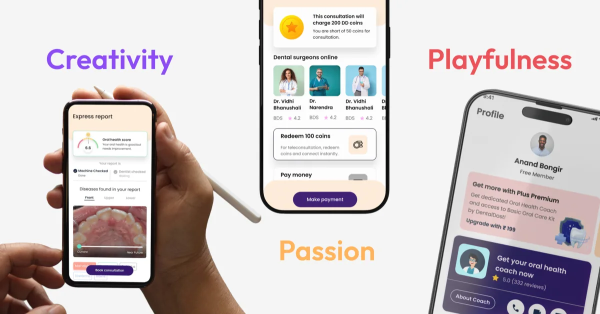
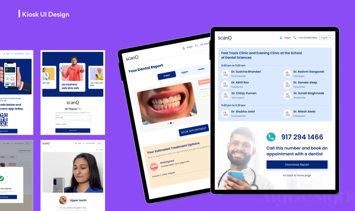
From the brand foundation, we moved into product design. The mobile app UX was built around simplicity and guidance — users needed to feel confident at every step of the scanning process, with no ambiguity about what to do next. The kiosk interface required a separate design approach: larger touch targets, self-explanatory flows, and content that could be read in bright outdoor light. Throughout, we developed a comprehensive design system that kept every touchpoint speaking the same visual language.
The Result
ScanO launched with a unified brand presence across digital and physical spaces — a first in India's dental health category. The mobile app, kiosk UI, and field collateral all operate from the same design system, ensuring that a user who encounters ScanO at a dental camp and later downloads the app encounters a consistent, recognisable experience. The brand has since expanded its market presence, with ScanO's design serving as a competitive differentiator in a space where most products default to generic medical aesthetics.
Deliverables
- Logo design & brand identity
- Color system & typography
- Brand guidelines document
- Mobile app UX wireframes & UI
- Kiosk interface design
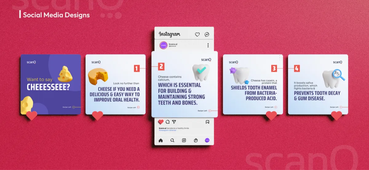
- Booth & print collateral
"Sukratu has been part of our company from day one and we couldn't have done it without them. From branding to product design, they've been an invaluable partner in building ScanO."
Rajat Kabade
ScanO by DentalDost
Brand & Product Applications
What this work proves
A brand system only works if it stays consistent everywhere it ships. This project shows the identity thinking and visual rules MyDesigner builds — and how Client Memory keeps human and AI-assisted output on-brand long after launch.
Related services
This project drew on brand identity, visual systems, and brand-aligned design rules.
Explore brand identity →Talk through similar work
Let's discuss how Client Memory and a creative operating rhythm can keep your brand consistent across everything you ship.
Talk through what your team needs to ship