Last updated:
Dense Interfaces Are Back: Why Information Hierarchy Beats Minimalism in 2026
Minimalism is out. Dense, information-rich UIs are in. Here's why 2026 startups are ditching whitespace for data-driven design that converts.
Minimalism became the default design mode for a generation of startups. Clean, spacious, restrained. And for a while, it made sense — it was a reaction to the cluttered, over-designed interfaces of the 2000s.
But the pendulum has swung too far. When minimalism means hiding information behind extra clicks, it stops being good UX and starts being a usability problem.
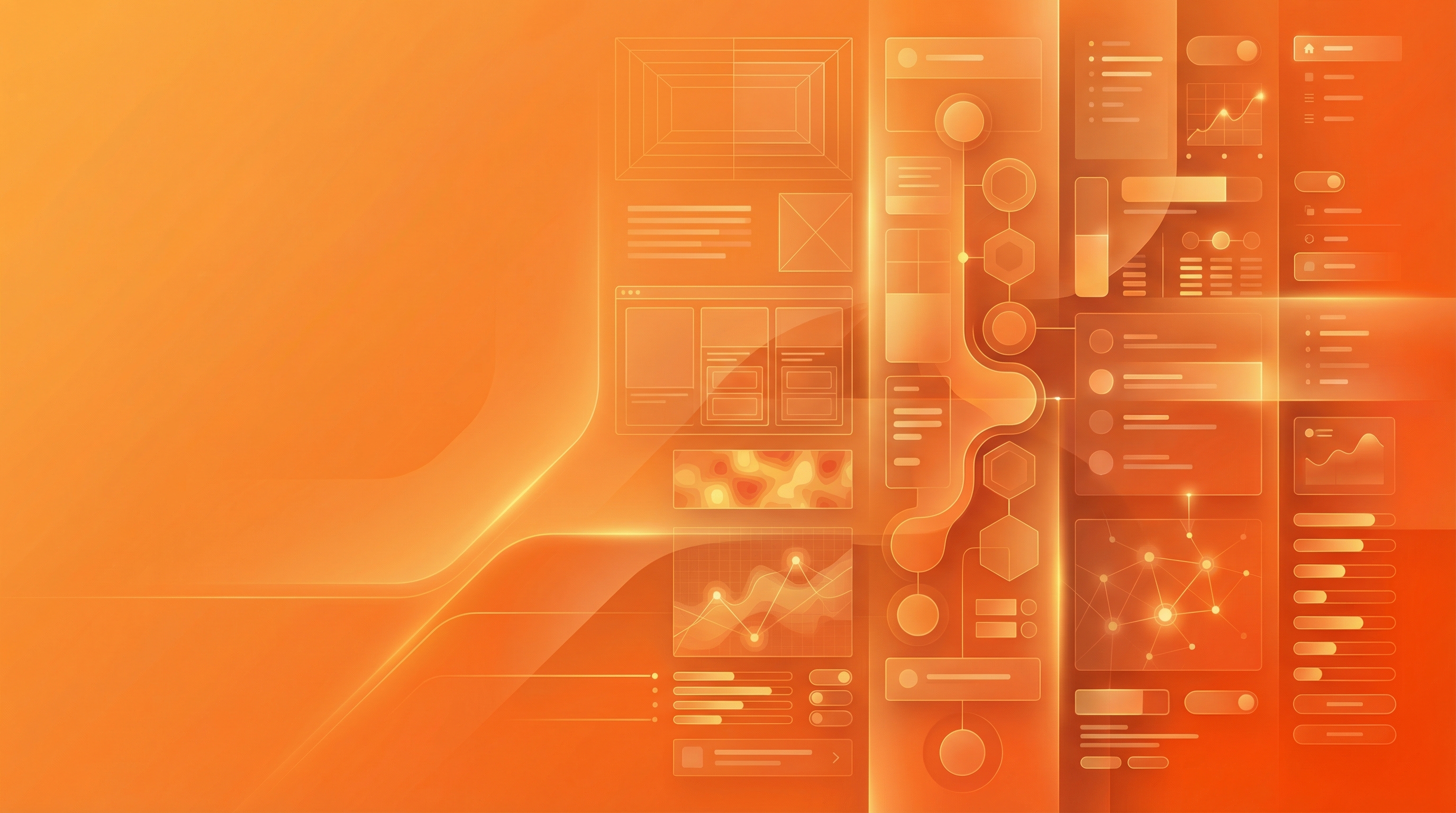
The products gaining ground in 2026 — Notion, Linear, Superhuman, Stripe — share something in common: they pack more information per screen while staying legible. That's not an accident. It's intentional density, often achieved through modular bento grid layouts.
What density actually means
Dense doesn't mean cluttered. The difference is information hierarchy.
Nielsen Norman Group defines visual hierarchy as the arrangement of elements to show their order of importance. In a dense interface, hierarchy does the heavy lifting — size, contrast, position, and weight guide the eye so users know where to look without thinking about it. Elements aren't removed; they're arranged.
Research on UI density shows that minimalist interfaces can actually increase cognitive strain when users need to navigate multiple levels to find information. Density, when structured correctly, reduces that strain — users see what they need without hunting.
Bloomberg Terminal is the extreme example. It's legendarily dense, but traders love it because everything they need is visible at once. No submenus. No guessing. Data, arranged by priority.
Why it matters for product teams
Power users don't want simplicity — they want speed. Dense, information-rich dashboards reduce clicks and page loads to access key metrics. For users who live in your product, that efficiency compounds into a meaningfully better experience. Well-placed micro-interactions can further guide the eye without adding visual clutter.
Enterprise buyers expect it. B2B software buyers are evaluating products on how quickly they can get to information. An interface that hides data behind progressive disclosure feels like friction to someone who knows what they want.
Mobile isn't the constraint it used to be. Progressive disclosure, collapsible sections, and swipe-based navigation mean you can build density into mobile without sacrificing usability. The assumption that mobile forces minimalism is increasingly outdated.
Five things to do differently
1. Audit your click depth. Open your dashboard and count how many clicks it takes to reach key metrics. If it's more than one, you're hiding value. Density starts with surfacing what users need at the top level.
2. Use hierarchy instead of removal. Before deleting an element, ask whether it could stay if it were smaller, lower contrast, or repositioned. Size, colour, and position can deprioritise something without removing it — and that's often the better call.
3. Lean into tables and lists. Dense data displays — Linear's issue list, Notion's database views — let power users scan and act faster than card-based layouts. Pair them with filters and search to give users control over the density.
4. Test with users, not designers. Designers are trained to notice visual clutter. Users are trying to complete tasks. Run task-based usability tests and measure time-to-completion, not how clean the interface looks. The two don't always align.
5. Check what your competitors are doing. If everyone in your category has minimalist interfaces, going denser is a legitimate differentiator. Interface density can be a competitive moat — users who switch to your product for the efficiency don't go back.
The bottom line
Minimalism was a correction to the over-designed interfaces of the 2000s. Dense, hierarchical interfaces are the 2026 correction to minimalism that went too far.
The goal was never whitespace for its own sake. It was clarity. And clarity, it turns out, often comes from showing more — not less — when the hierarchy is right.
MyDesigner designs high-density, high-clarity interfaces for startups — dashboards, SaaS products, and data-heavy views built to convert without overwhelming. See how it works or explore our web app design service.