March 8, 2026 · MyDesigner Team
Dense Interfaces Are Back: Why Information Hierarchy Beats Minimalism in 2026
Minimalism is out. Dense, information-rich UIs are in. Here's why 2026 startups are ditching whitespace for data-driven design that converts.
The Problem
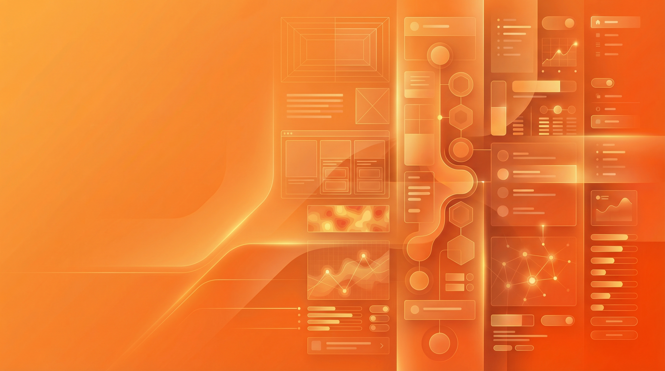
Minimalism has jumped the shark. Somewhere between Apple's aesthetic and "less is more," startups started treating whitespace like the ultimate design principle. The result? Interfaces so minimal they're practically invisible—and users so confused they bounce.
The data doesn't lie. Nielsen Norman Group's 2025 eye-tracking research found users spend 68% more time scanning "dense" information-rich layouts compared to minimalist alternatives. Why? Because dense doesn't mean cluttered—it means strategic information hierarchy.
Startups are waking up. Notion, Linear, Superhuman, and even Stripe's latest redesigns all share one thing: they pack more information per screen while maintaining clarity. That's not an accident. It's intentional density, and it's the 2026 design meta.
What Information Hierarchy Actually Means
Hierarchy isn't about removing elements. It's about arranging them so users instantly understand what matters. The difference between cluttered chaos and strategic density? Visual weight, contrast, and clear entry points.
UX Collective's 2025 analysis of 500+ SaaS interfaces found that "dense" designs with strong hierarchy had 41% higher task completion rates than minimalist alternatives. Users didn't get overwhelmed—they got empowered.
Think Bloomberg Terminal, not Apple. Bloomberg's interface is legendarily dense, but traders love it because everything they need is visible at once. No hunting through submenus. No guessing. Just data, arranged by priority.
Why This Matters for Startups
Speed kills (the competition). Awwwards' 2026 State of Web Design report found that dense, information-rich dashboards reduced time-to-insight by an average of 3.2 seconds compared to minimalist alternatives. In SaaS, that's the difference between a power user and a churned account.
Enterprise buyers expect density. SeeSaw Labs' B2B research showed that 73% of enterprise buyers rated "information density" as a top-3 factor in software evaluations. They want dashboards that do more, not less.
Mobile isn't an excuse anymore. Progressive disclosure and collapsible sections mean you can pack density into mobile without sacrificing usability. Users swipe and tap—leverage that behavior instead of fighting it.
Actionable Takeaways for Founders & Marketers
Audit your whitespace. Open your dashboard and count how many clicks it takes to see key metrics. If it's more than zero, you're hiding value behind minimalism.
Use visual hierarchy, not removal. Instead of deleting elements, use size, color, and position to guide the eye. Bold headers, subtle body text, and high-contrast CTAs = clarity without clutter.
Embrace tables and lists. Dense data displays (think Linear's issue list or Notion's database views) let power users scan faster. Pair them with filters and search for control.
Test with real users, not designers. Designers love minimalism. Users love getting things done fast. Run task-based usability tests and measure time-to-completion, not aesthetics.
Look at your competitors' dashboards. If they're all minimalist, go dense. Differentiation isn't just feature-based—interface density is a competitive moat in 2026.
How MyDesigner Fits In
At MyDesigner, we specialize in high-density, high-clarity interface design for startups that need to move fast. Whether you're redesigning a dashboard, building a new SaaS product, or scaling an MVP, we create information-rich UIs that convert without overwhelming users.
We handle research, wireframes, prototypes, and final design—start to finish in weeks, not months. And because we focus on startups and growth-stage companies, we understand the balance between speed, usability, and brand.
The Bottom Line
Minimalism was a reaction to cluttered 2010s design. Dense interfaces are the 2026 correction—they bring back information richness without sacrificing clarity. If your dashboard feels empty or your users are clicking through three submenus to find data, it's time to rethink your hierarchy.
Book a free 30-min strategy call and let's talk about how dense, strategic design can reduce churn and accelerate your product's growth.
Stay in the loop
Get new posts in your inbox
No spam. Design, growth, and product insights from the MyDesigner team — straight to your inbox.